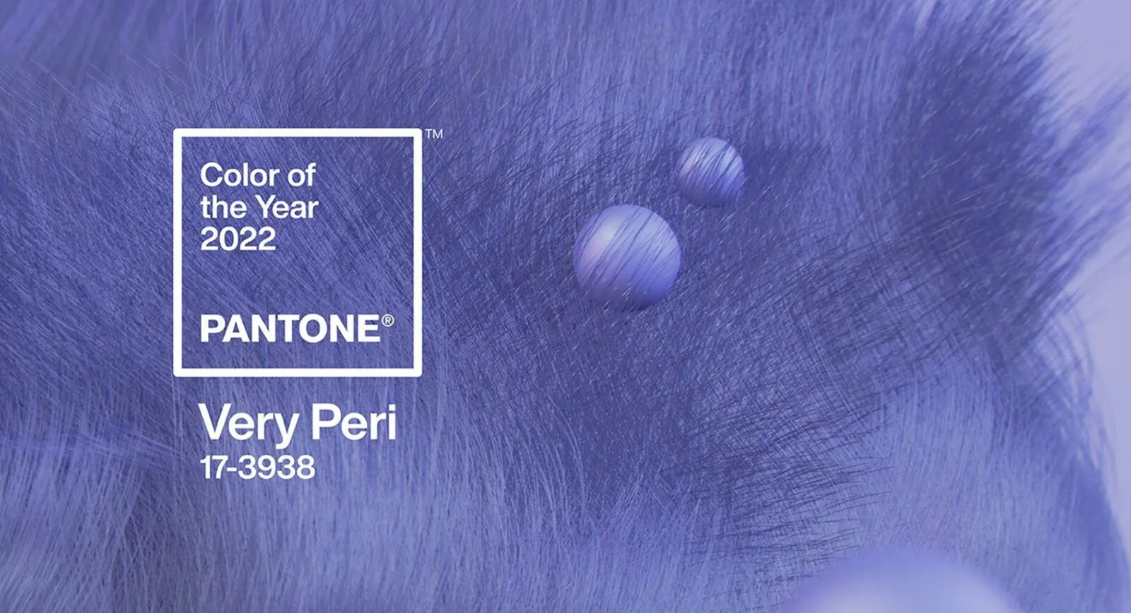
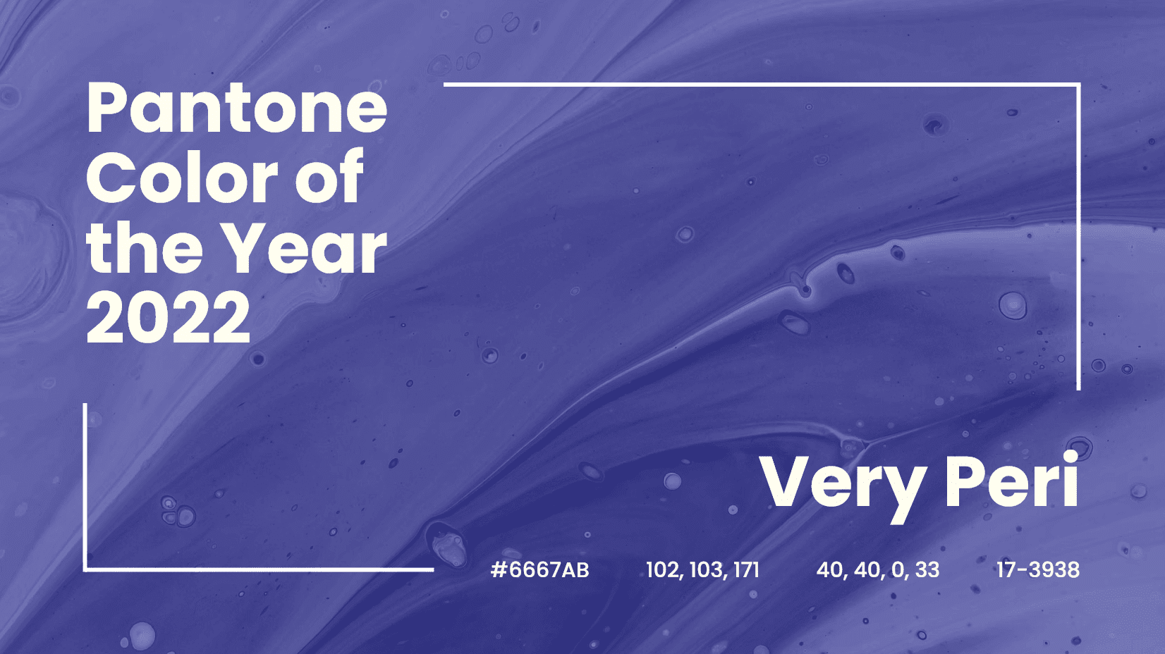
Very Peri: These Jewels Channel Pantone’s 2022 Colour of the Year
According to an already established tradition, I always devote one of the first articles of the New Year to the Pantone Color Institute and its announcement of the ‘Colour of the Year’. This year’s shade is Pantone 17-3938, which has the self-explanatory name Very Peri: “Very Beautiful”.
For the past 23 years, at the dawn of each new calendar year, the Pantone Color Institute has announced the colour that will embody the upcoming year. Its selection is made by an international group of experts whose names are kept in the strictest confidence. The reason for this mystery is easily explained: designers, representatives of the cosmetics industry and everyone who follows fashion and trends will be guided by their final decision for the whole of the following year. So, the colour of 2022 is a lilac shade with the number 17-3938 and the name Very Peri – “Very Beautiful”. For the first time in the history of the Institute, the colour of the year was not chosen from its existing wide palette but was created anew using digital technologies and inspired by the current global situation.
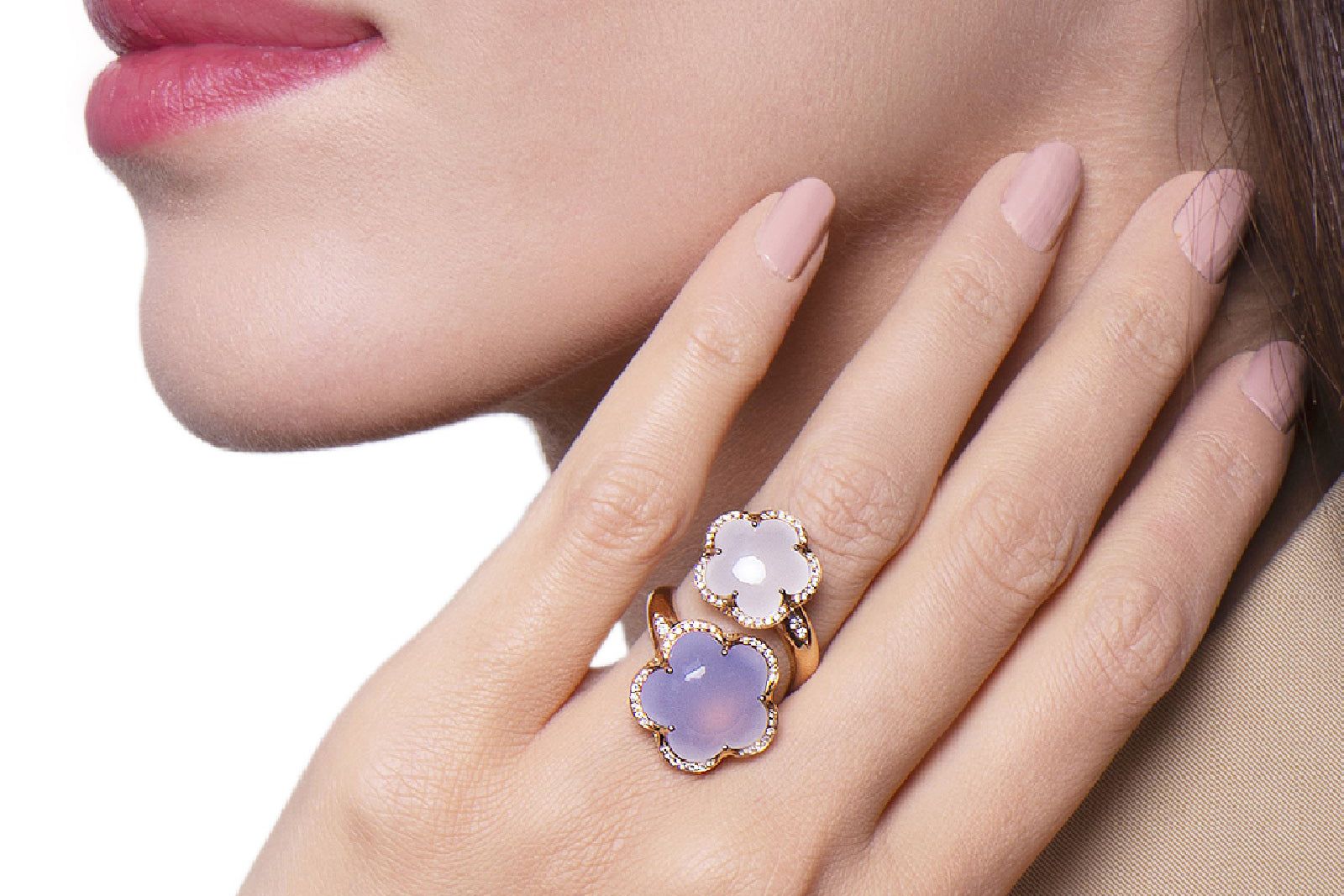
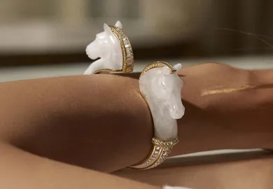
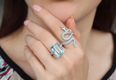
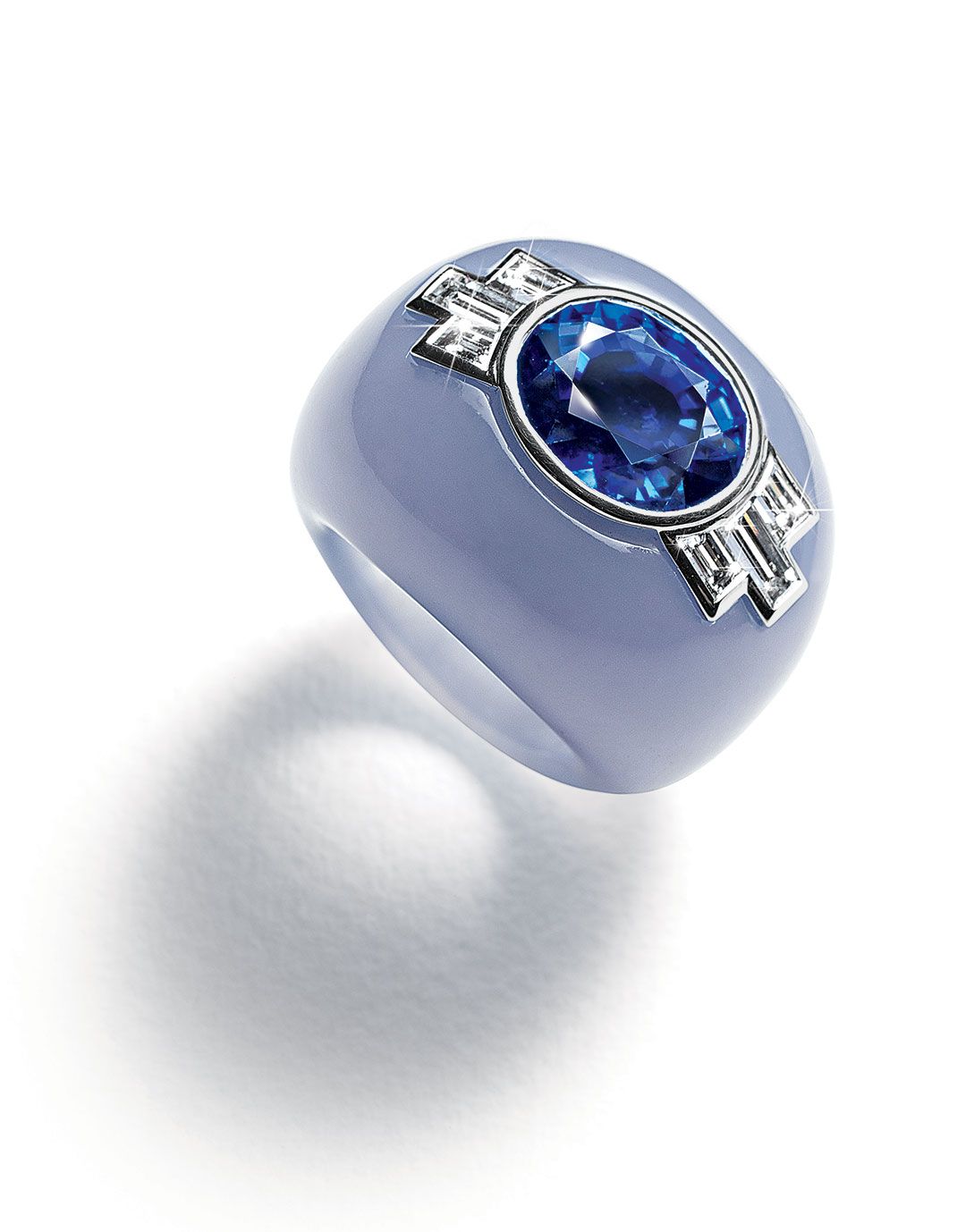
Pasquale Bruni Bon Ton rings, including a carved chalcedony similar to the ‘Very Peri’ Pantone Colour of the Year
“We are living in transformative times. Pantone 17-3938 Very Peri is a symbol of the global zeitgeist of the moment and the transition we are going through. As we emerge from an intense period of isolation, our notions and standards are changing, and our physical and digital lives have merged in new ways. Digital design helps us to stretch the limits of reality, opening the door to a dynamic virtual world where we can explore and create new colour possibilities. With trends in gaming, the expanding popularity of the metaverse and a rising artistic community in the digital space, Pantone 17-3938 Very Peri illustrates the fusion of modern life and how colour trends in the digital world are being manifested in the physical world and vice versa,” explains the Institute.
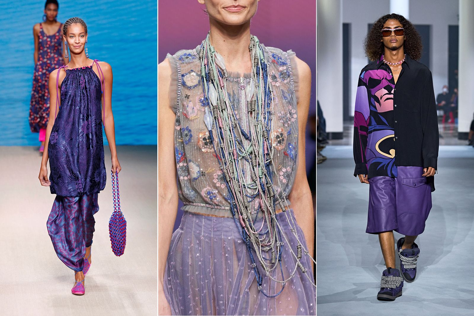
‘Very Peri’ on the catwalk at Giorgio Armani (left and centre) and Lanvin
President Laurie Pressman notes that Pantone 17-3938 Very Peri combines the “constancy” of blue and the “thrilling energy” of red, symbolising dynamism, creativity, imagination and moving forwards. She also expressed the hope that this complex new red-violet-infused blue hue will perfectly highlight the novel possibilities of a rapidly changing world. I suggest you follow Laurie Pressman’s example and discover jewellery of the same shade as Pantone 17-3938 Very Peri. The world of gemstones offers us this colour with such stones as, for example, sapphires, spinel, jade, iolite, diamonds… but lavender chalcedony seems to be the closest to me! And in the hands of an experienced craftsman, the colour could be reproduced in enamel. To make it easier for you to navigate all these options, I have put together a series of designer jewels that, in my opinion, perfectly match Pantone 17-3938 Very Peri.
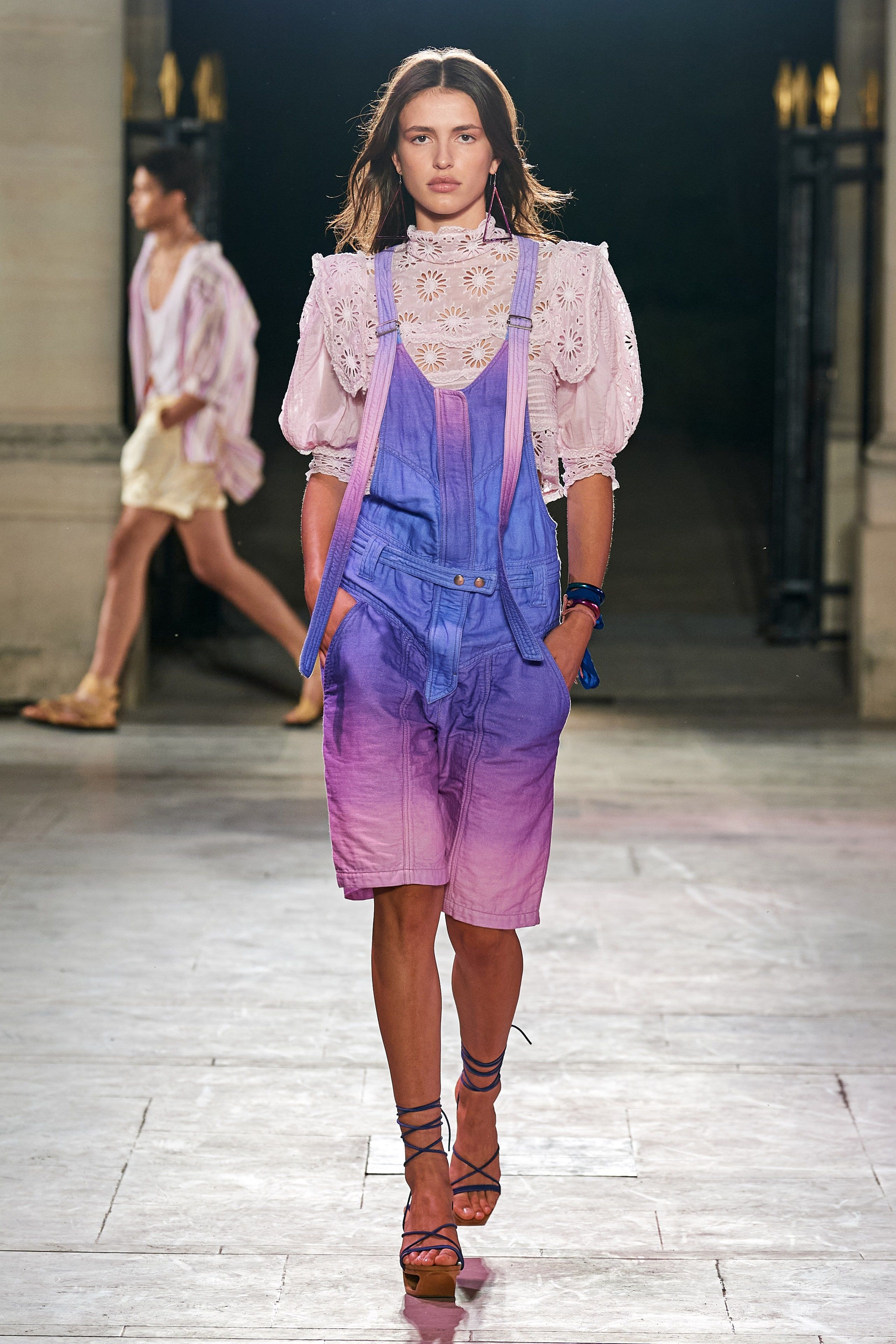
Isabel Marrant
Isabel Marrant
A model wears a ‘Very Peri’ shade on the SS22 runway
Tasaki
Tasaki
Moulin earrings in 18k white gold with Akoya pearls, South Sea pearls, diamonds and fancy colour sapphires
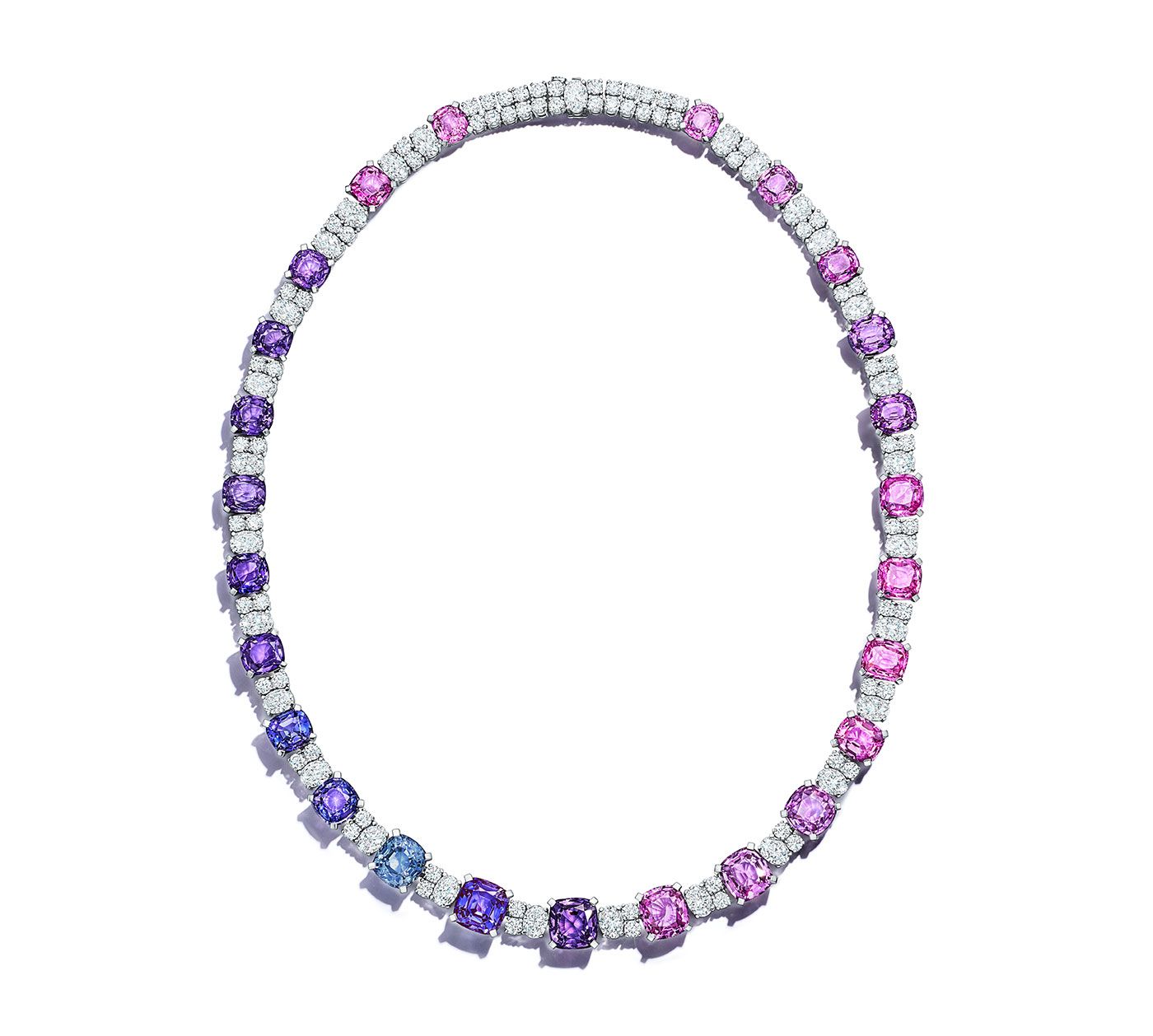
Tiffany & Co.
Tiffany & Co.
Multi-coloured sapphire necklace from the 2021 Blue Book Collection
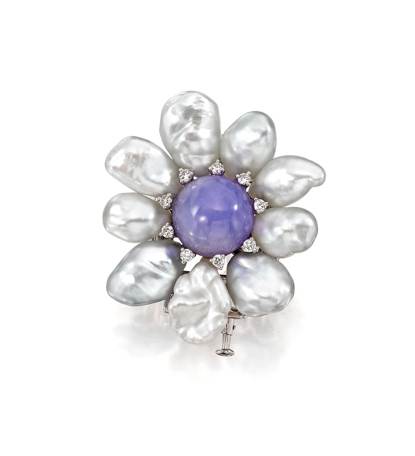
Assael
Assael
Baroque South Sea pearl and lavender jade brooch
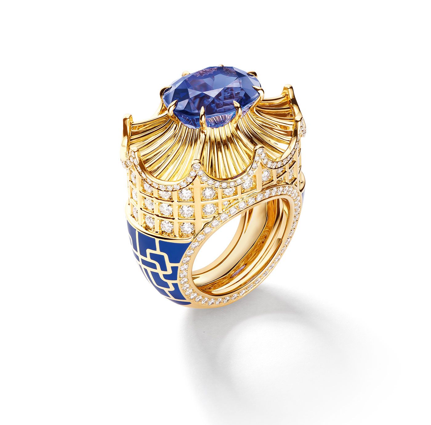
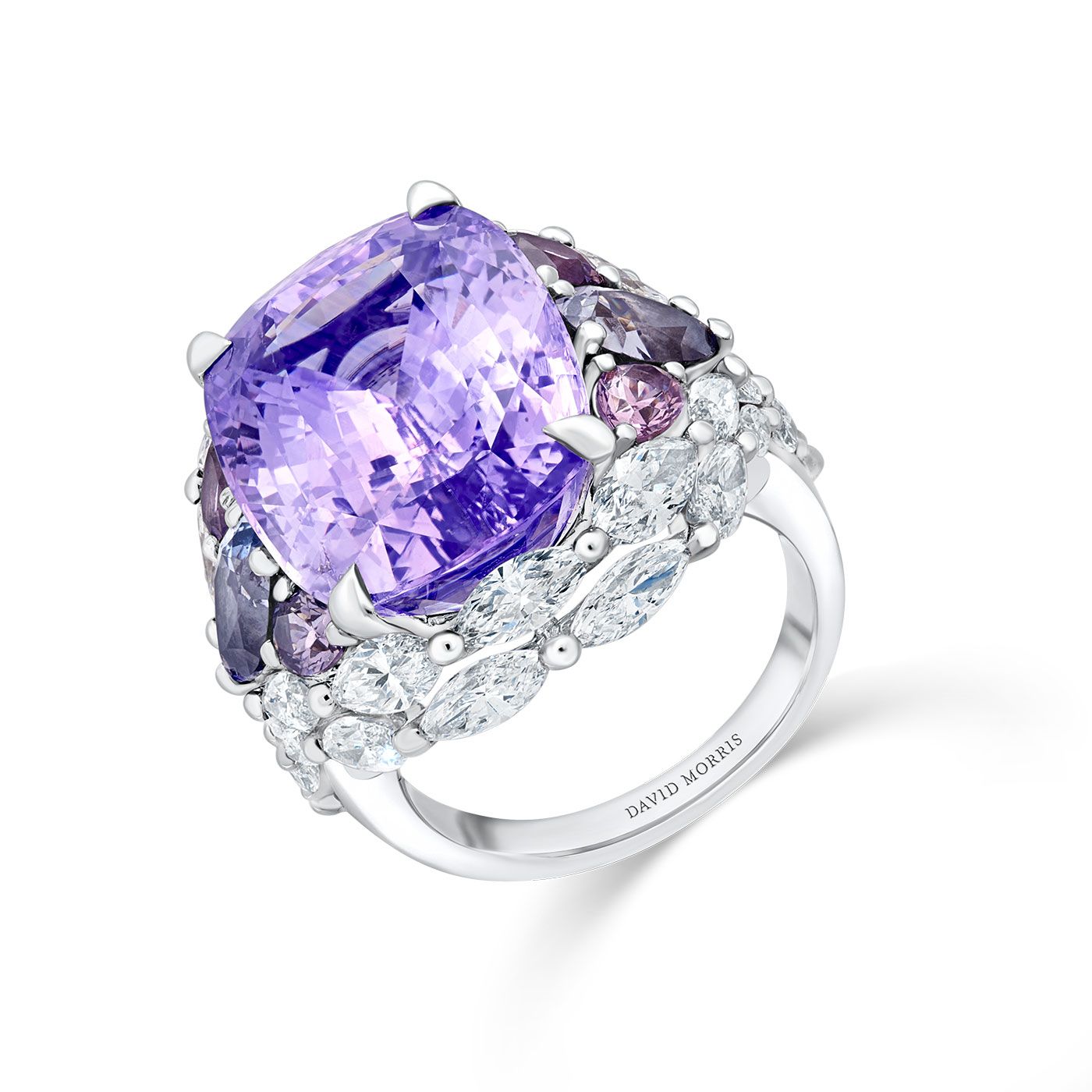
Chaumet
Chaumet
Qianlong ring in yellow gold and lacquer, set with brilliant-cut diamonds and one oval-cut vivid violetish-blue tanzanite of 9.58 carats
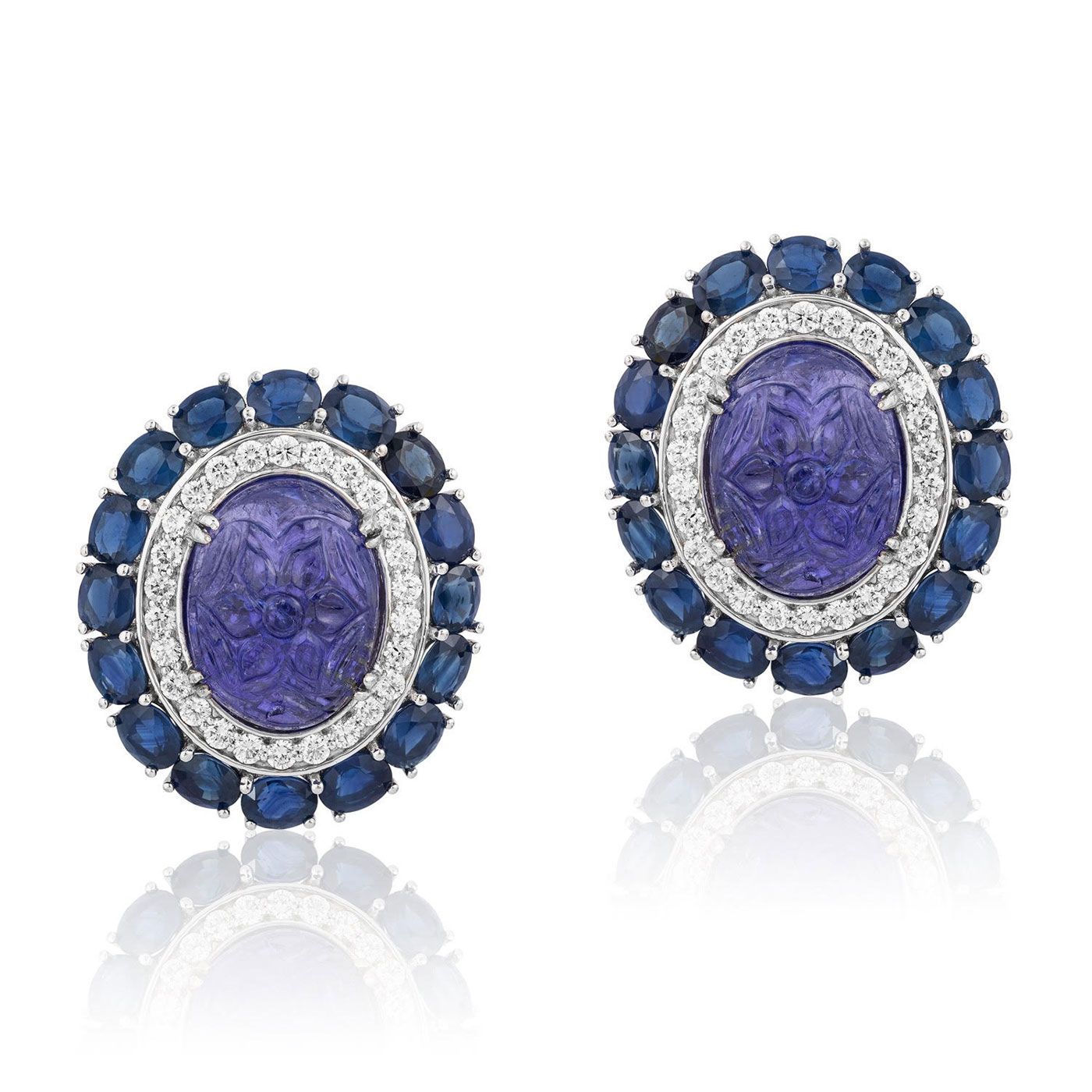
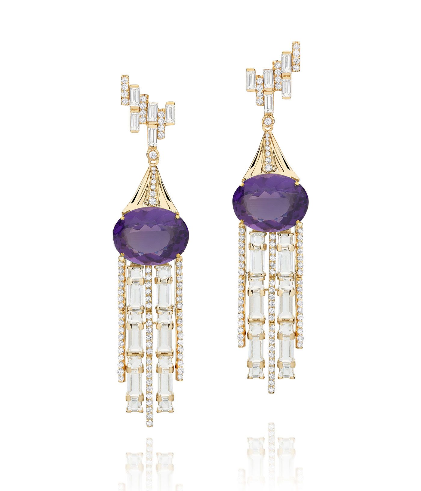
Andreoli
Andreoli
Carved gemstone and diamond earrings
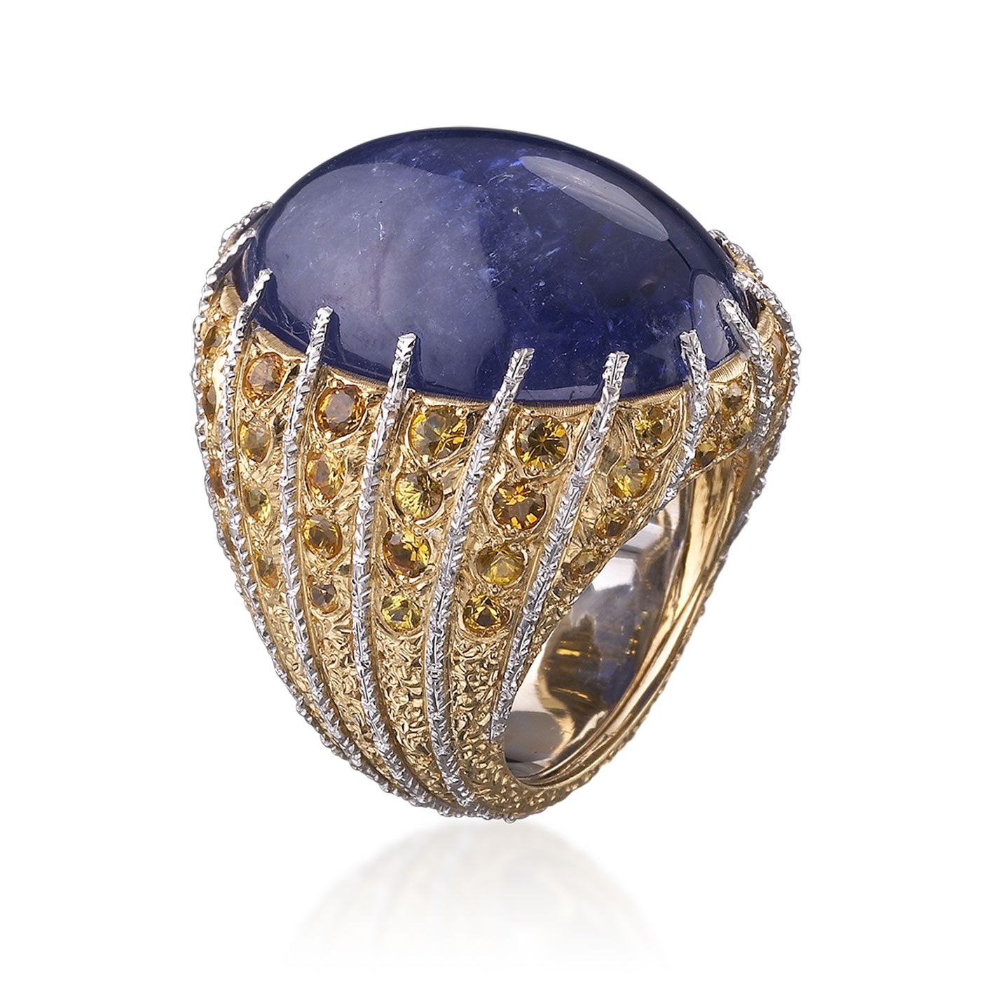
Buccellati
Buccellati
Cocktail ring with purplish-blue tanzanite on a mounting with white gold sprigs alternating with yellow gold and diamonds
Pantone Color Institute
Pantone Color Institute
Very Peri – the Pantone Colour of the Year 2022
Boodles
Boodles
Peacock ring with a cushion-shaped 16.45 carat amethyst and diamonds in platinum
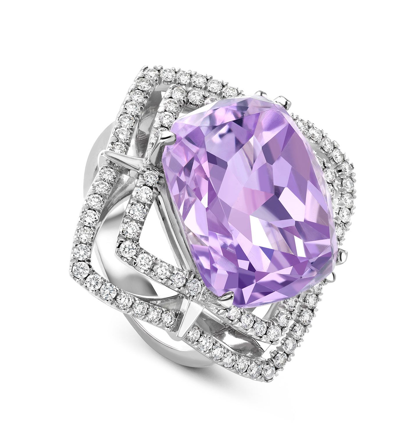
David Morris
David Morris
Cushion-cut light pink lilac sapphire ring of 19.89 carats with sapphire drops and white diamond marquise surround in 18K white gold
Carol Kauffmann
Carol Kauffmann
Waterfall earrings in 18k gold with amethysts, diamonds and white sapphires
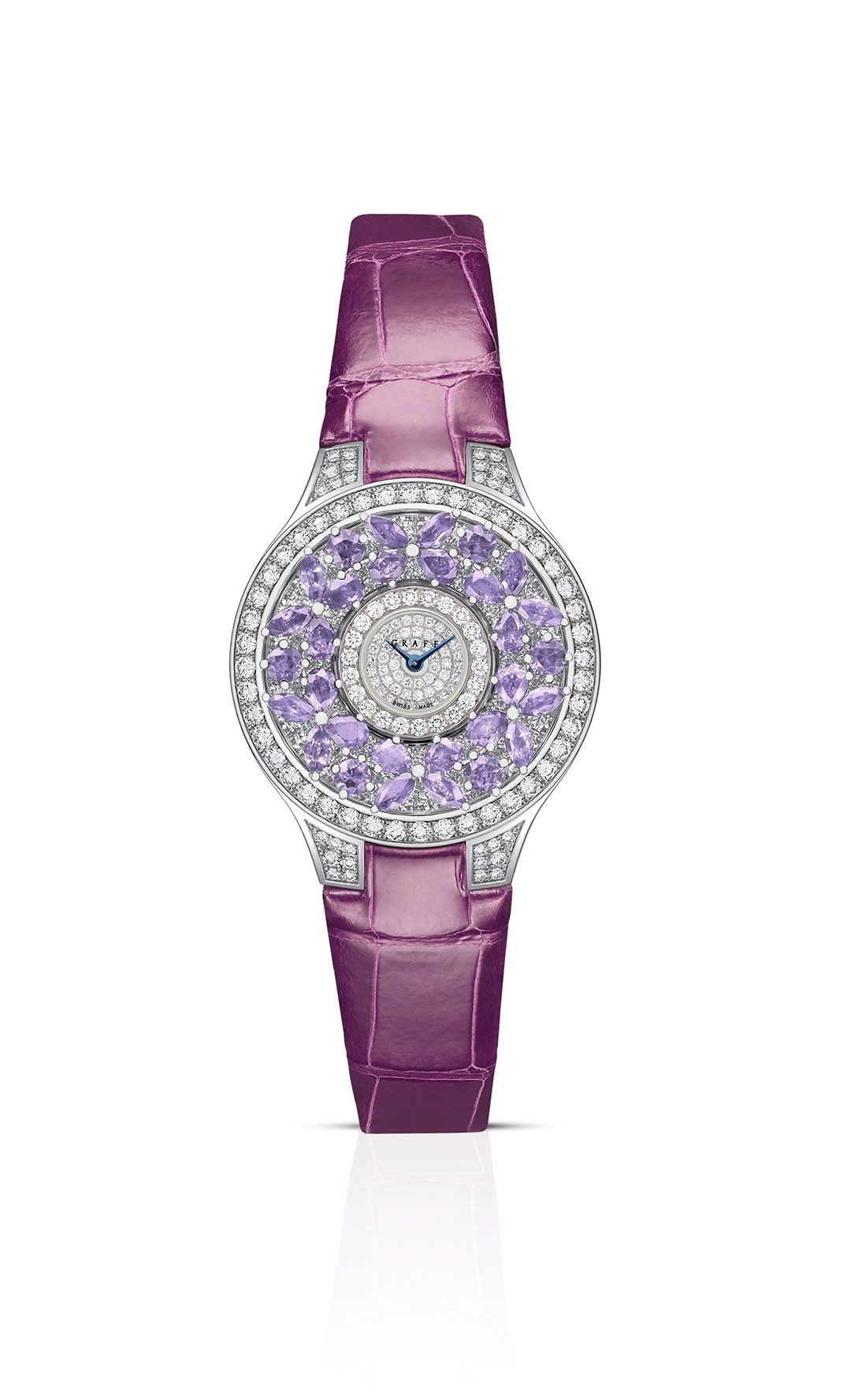
Graff
Graff
Classic Butterfly watch with violet sapphires and diamonds in 18k white gold
Bucherer Fine Jewellery
Bucherer Fine Jewellery
Pastello necklace and earrings with natural-coloured sapphires
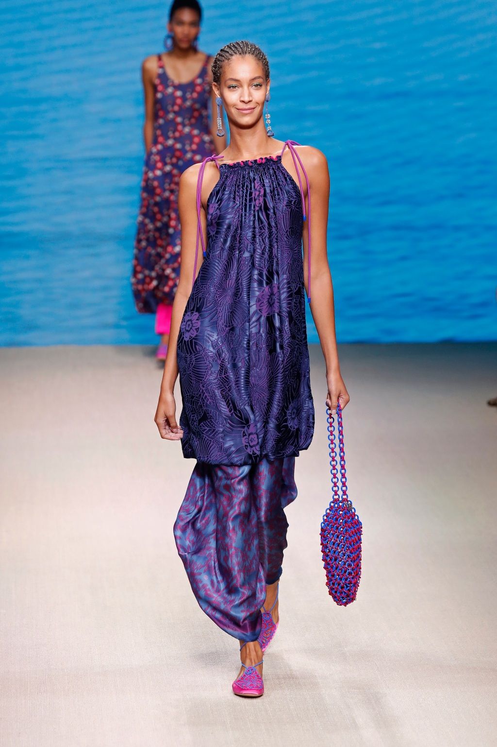
Lanvin
Lanvin
‘Very Peri’ on the SS22 runway
Verdura
Verdura
Vintage Pierre Noyée ring in carved chalcedony with an oval-shaped sapphire and diamonds
Robinson Pelham
Robinson Pelham
Juke cocktail ring with a 4.81 carat oval lilac amethyst surrounded by brown diamonds and pink sapphires in 18K rose gold
Harry Winston
Harry Winston
Winston Light Sparks ring with tanzanite from the Winston With Love Collection

Bvlgari
Bvlgari
Divas’ Dream High Jewellery necklace in pink gold with mother-of-pearl, amethyst beads, chalcedony beads, fancy shape chalcedonies, fancy shape malachites and pavé-set diamonds
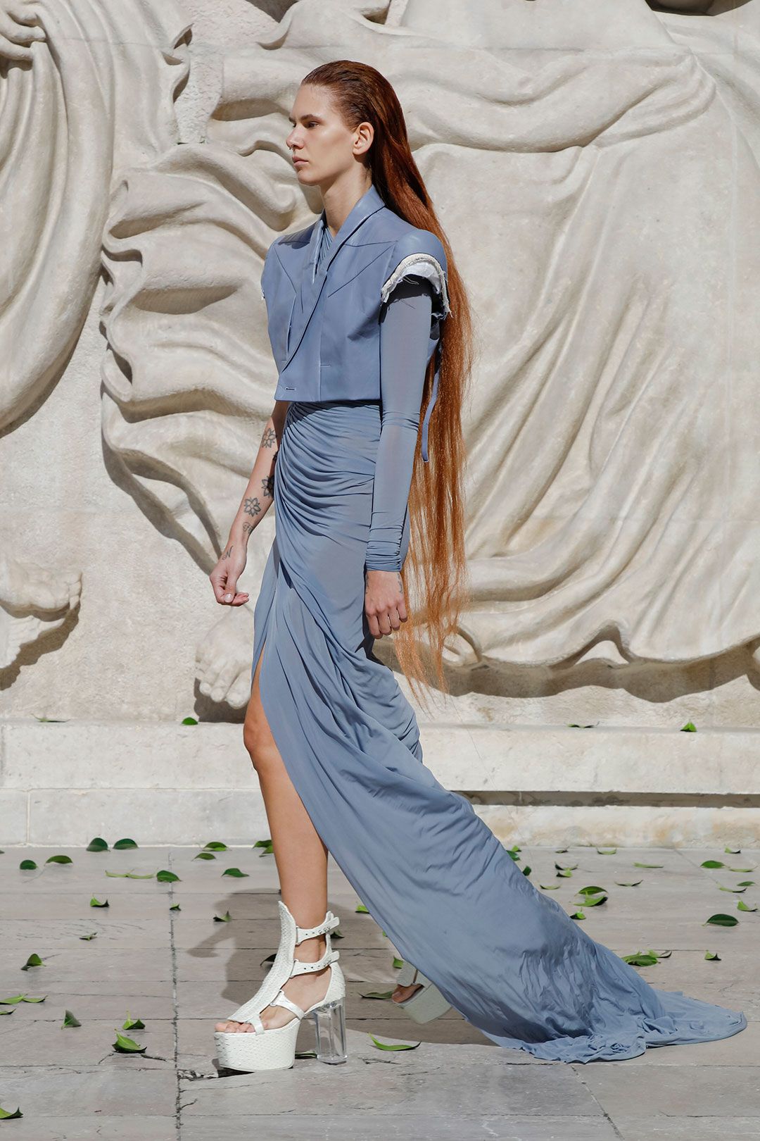
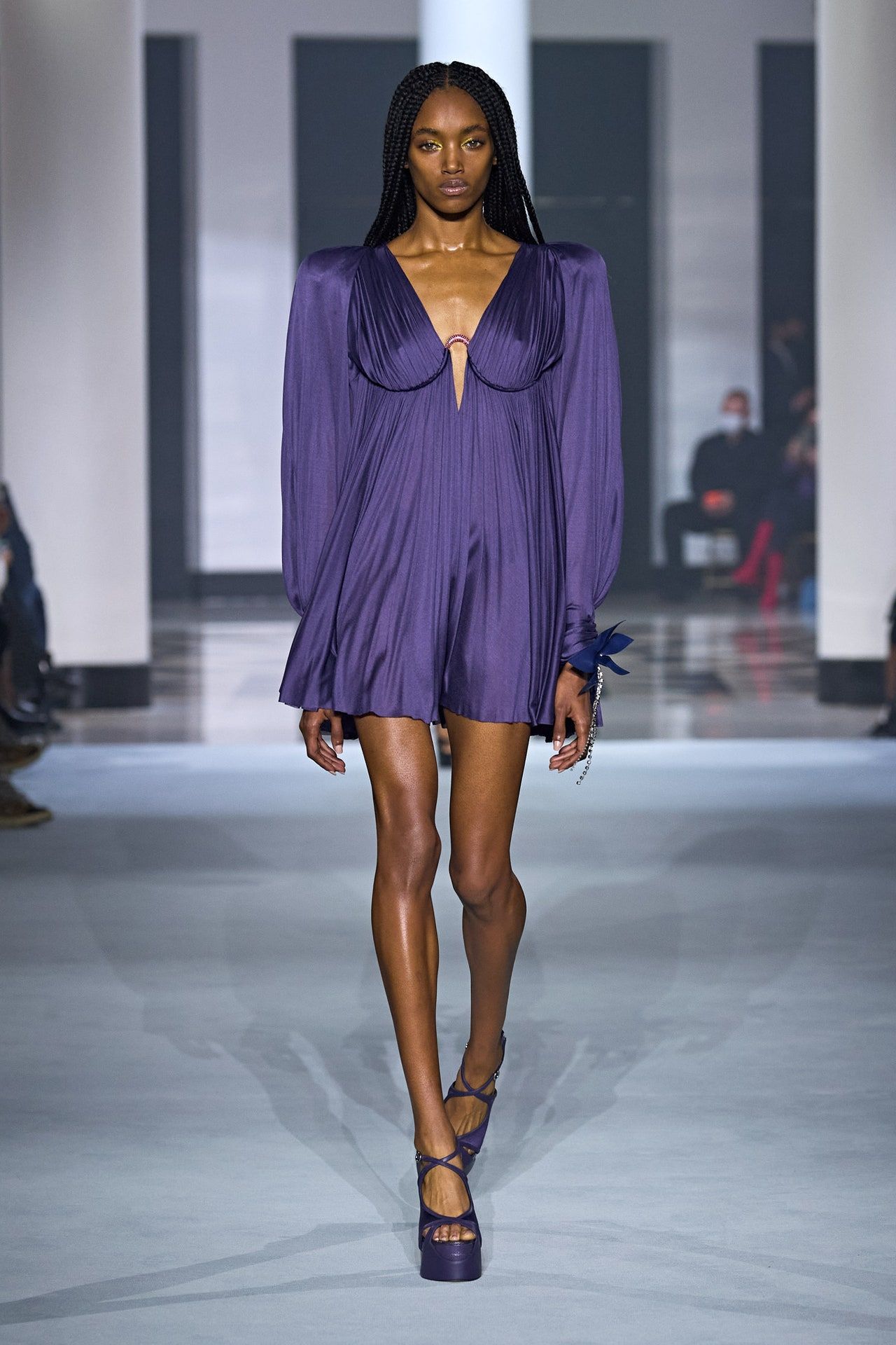
Rick Owens
Rick Owens
A model wears a ‘Very Peri’ coloured dress on the SS22 runway
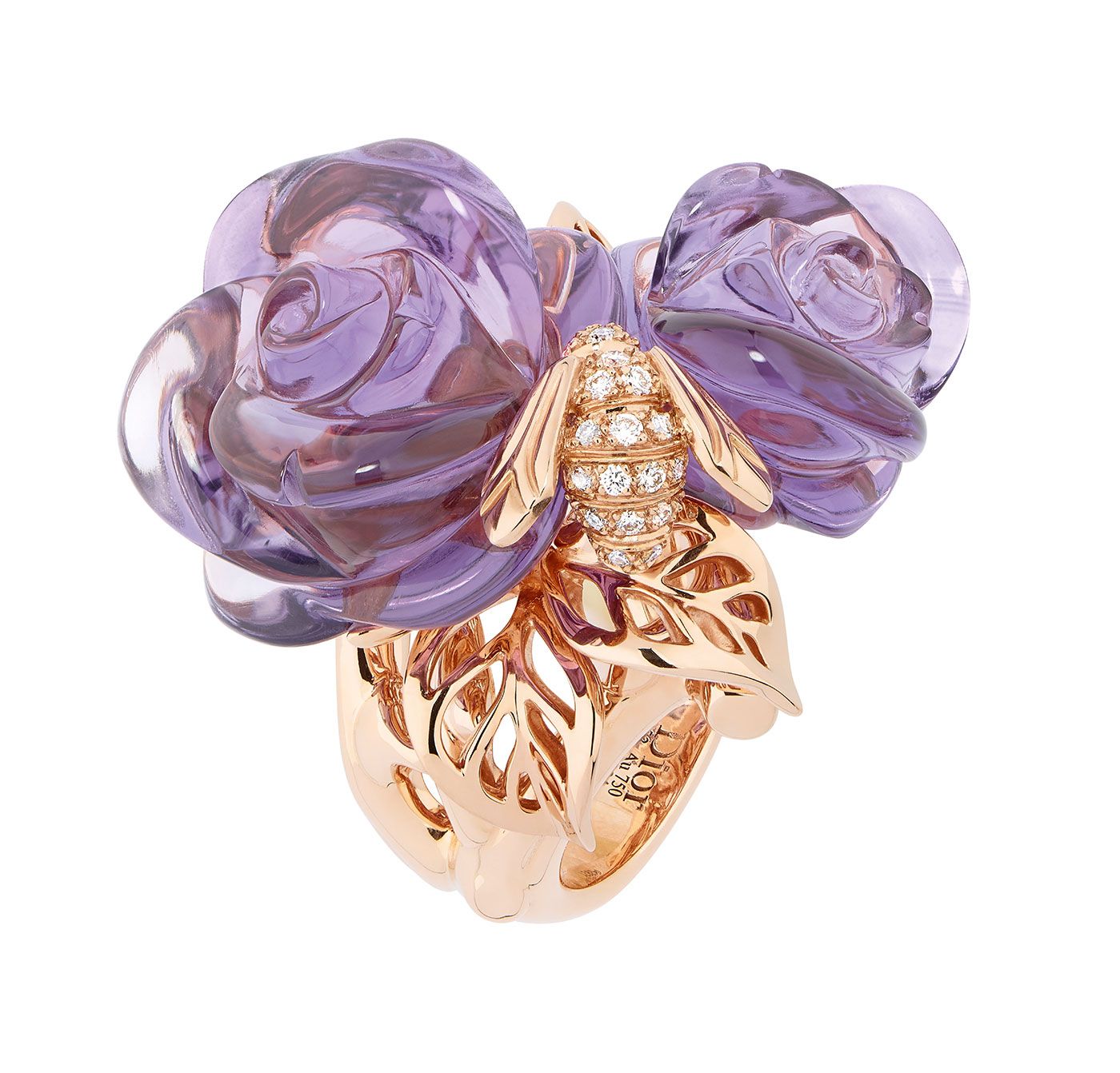
Dior
Dior
Rose Dior Pré Catelan ring with carved amethyst and diamonds in 18k rose gold
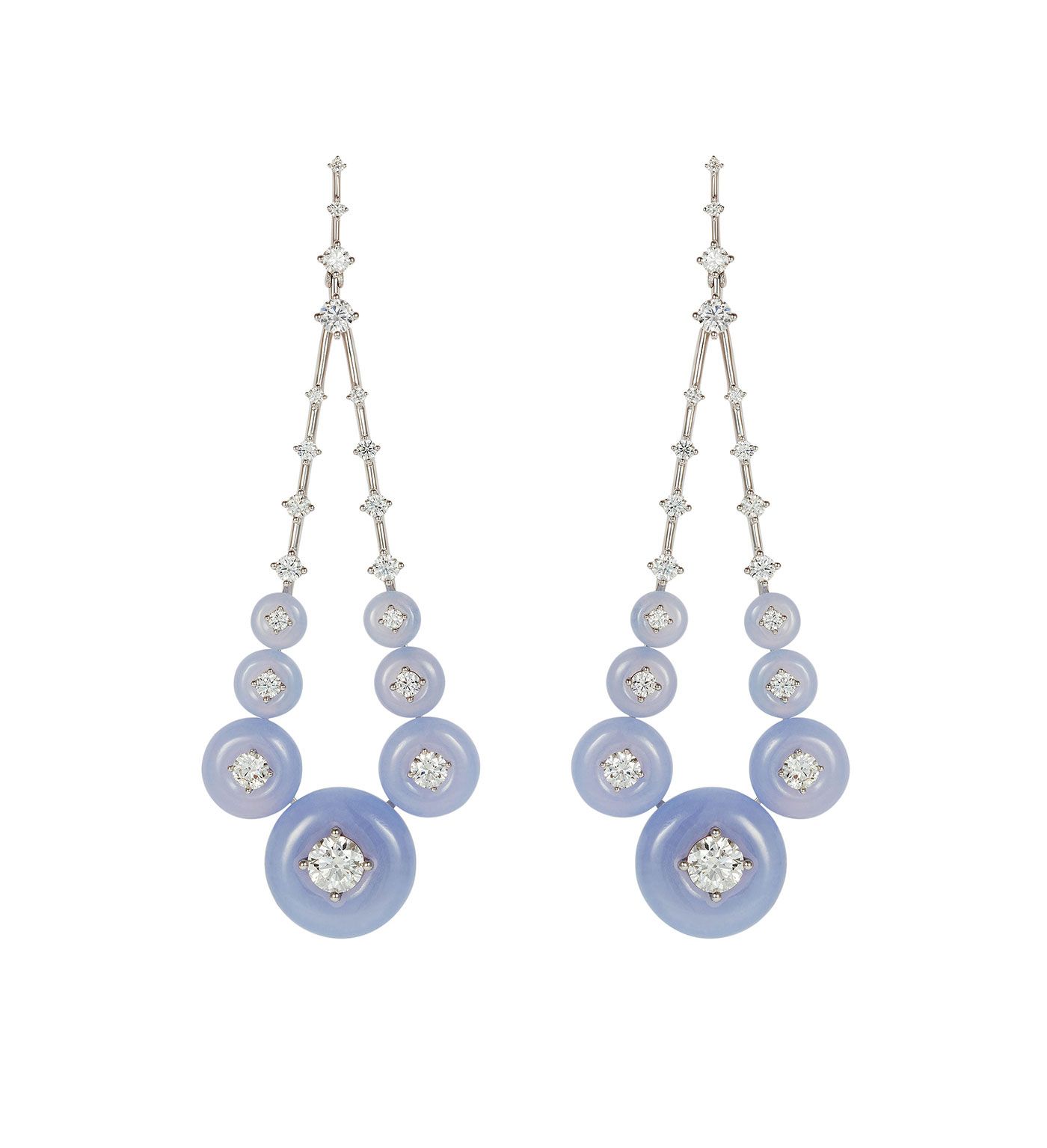
Fernando Jorge
Fernando Jorge
Gravity earrings in 18K gold with diamonds and chalcedony
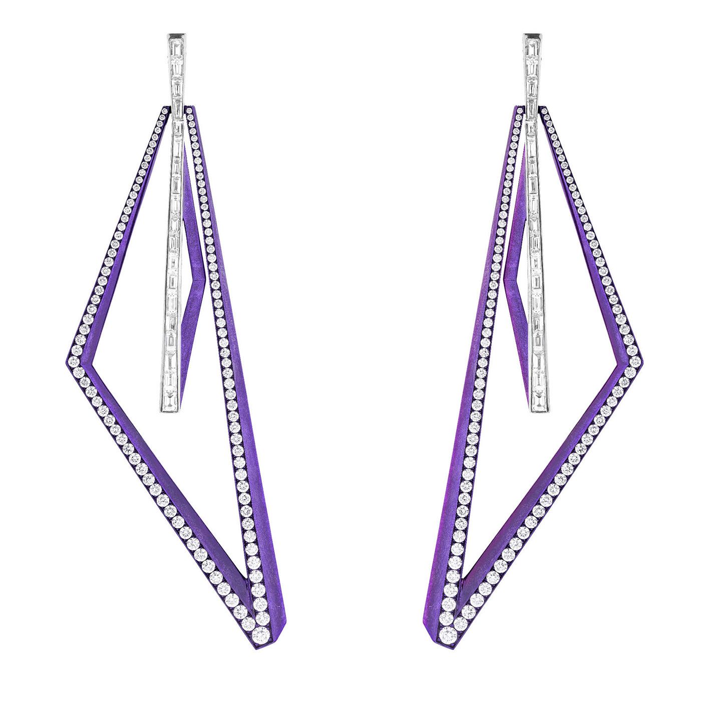
Stephen Webster
Stephen Webster
Vertigo Infinity earrings with diamonds in purple titanium
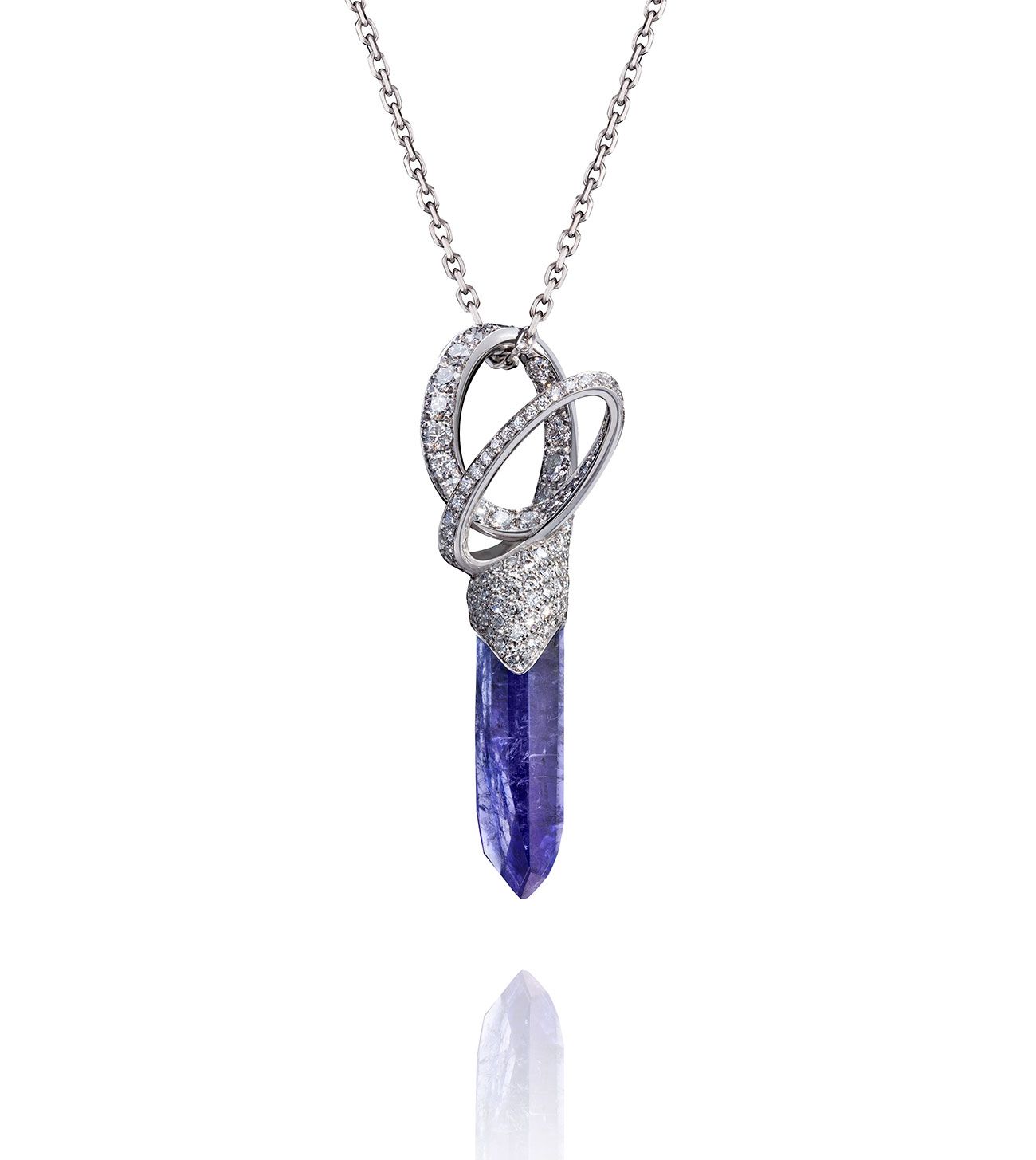
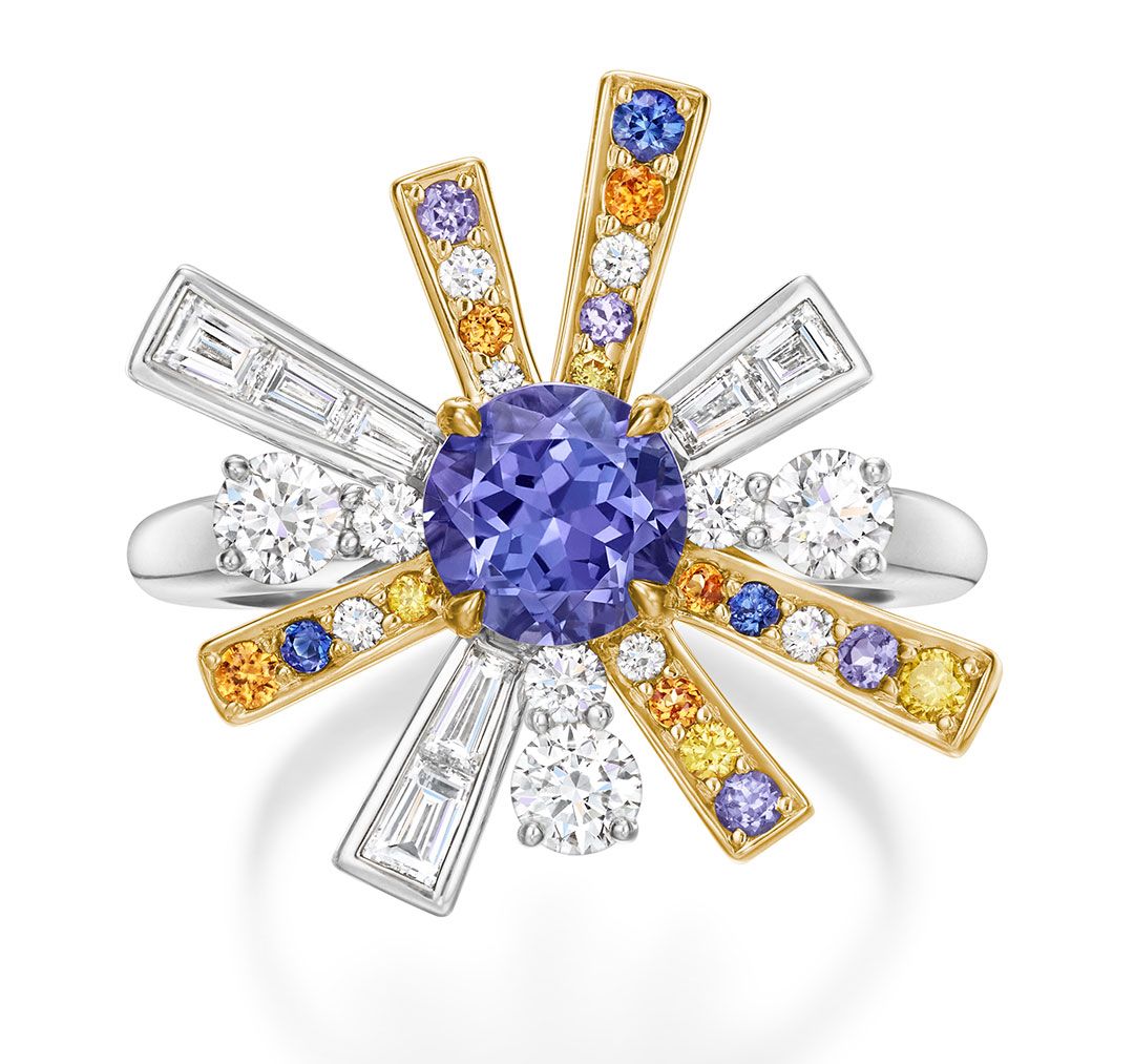
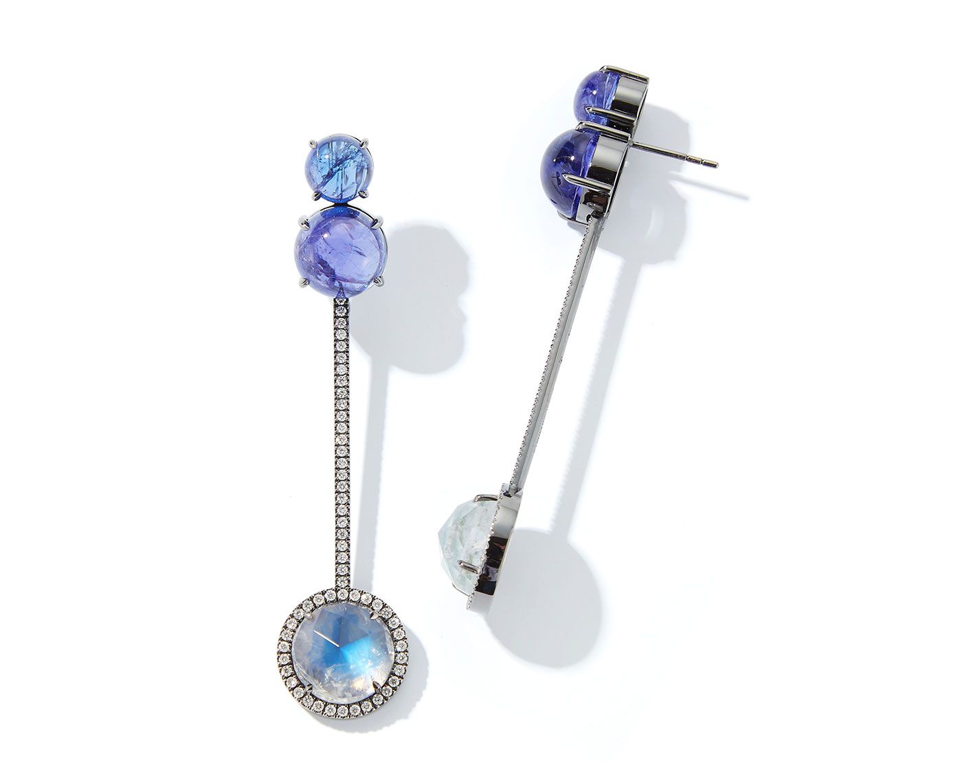
Hoehls
Hoehls
Creativity pendant with a tanzanite crystal and diamonds
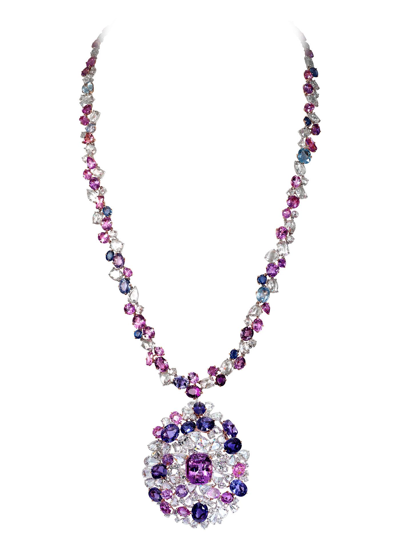
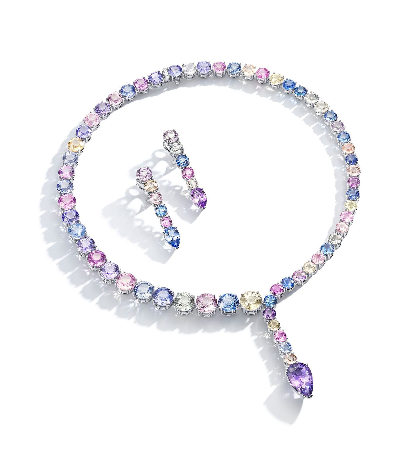
Moussaieff
Moussaieff
Pendant necklace with 89 carats of fancy coloured sapphires and 51 carats of diamonds
Giorgio Armani
Giorgio Armani
A model wears a ‘Very Peri’ shade on the SS22 runway
Katherine Jetter
Katherine Jetter
Tanzanite and moonstone Tik Tok earrings in 18k white gold
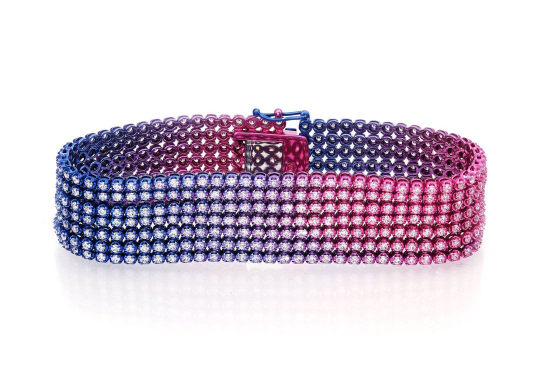
Ruchi Jewelry
Ruchi Jewelry
Aurora Nights Eos bracelet with 7.13 carats of diamonds set in tinted rhodium over 18k gold
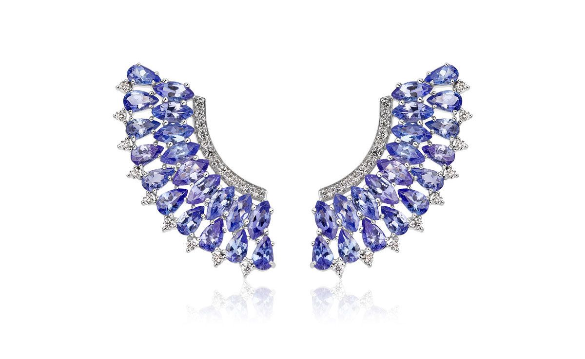
Hueb
Hueb
Mirage earrings in 18K white gold with tanzanites and diamond pavé
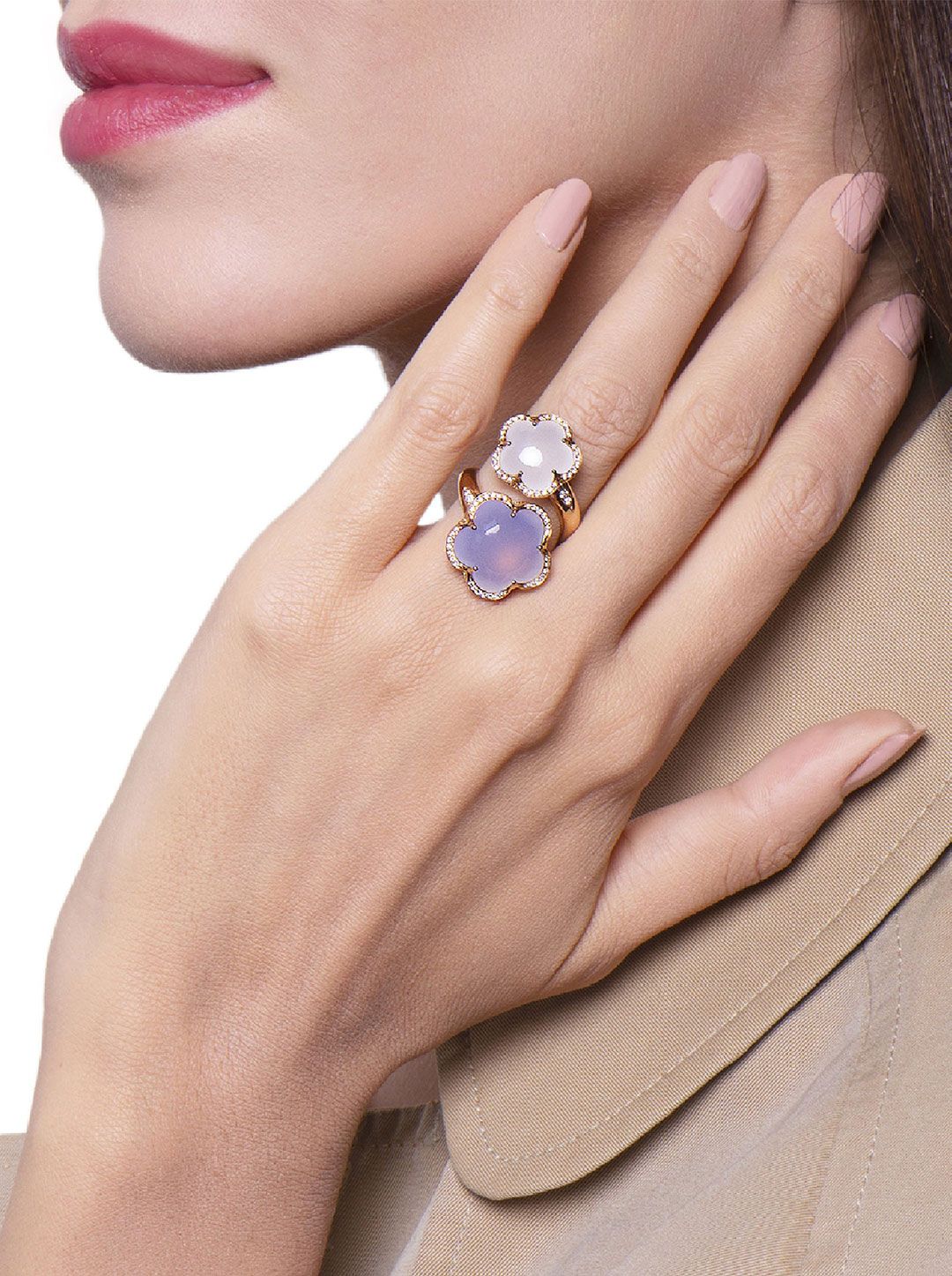
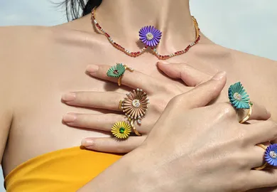
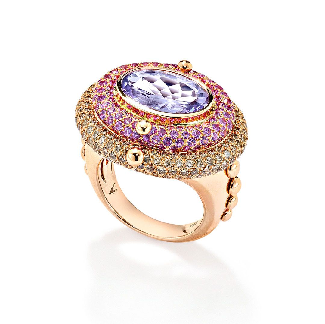
Pasquale Bruni
Pasquale Bruni
Bon Ton rings with carved chalcedony and milky quartz in 18K rose gold
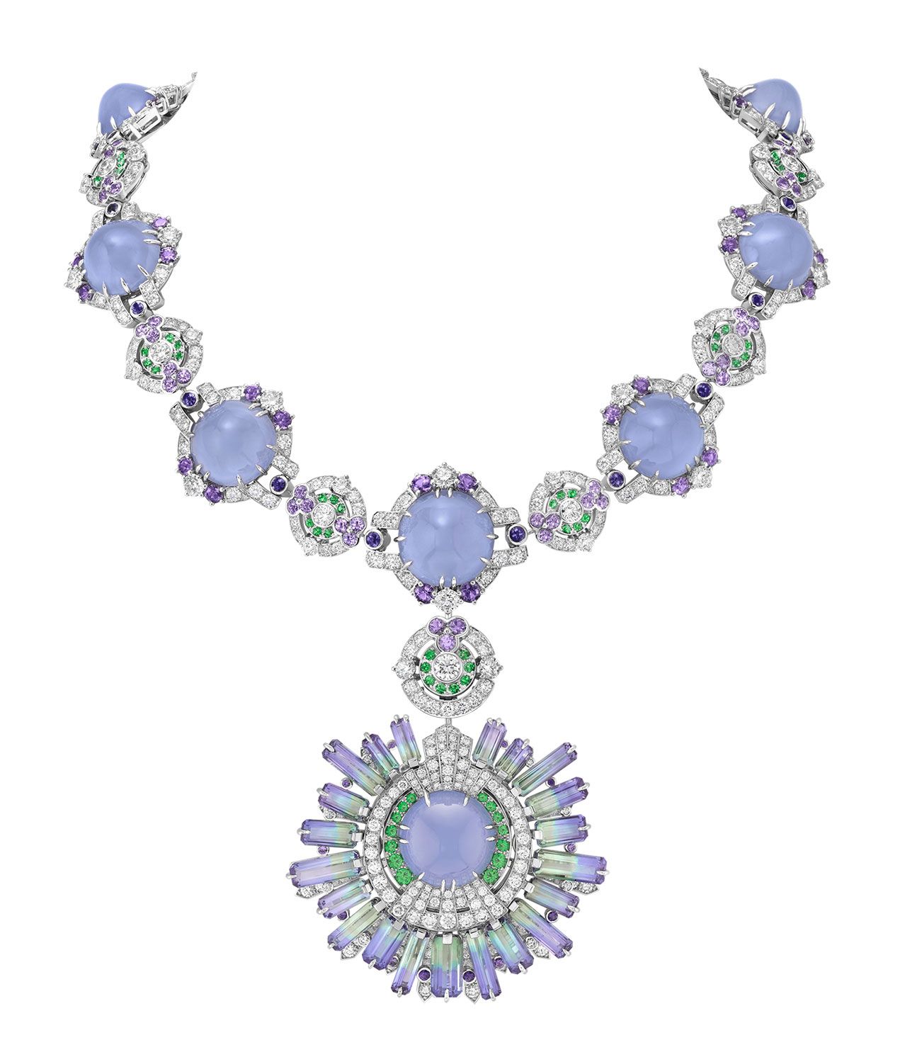
Van Cleef & Arpels
Van Cleef & Arpels
Cepheide High Jewellery necklace with chalcedony, tanzanites, diamonds, mauve sapphires and tsavorite garnets
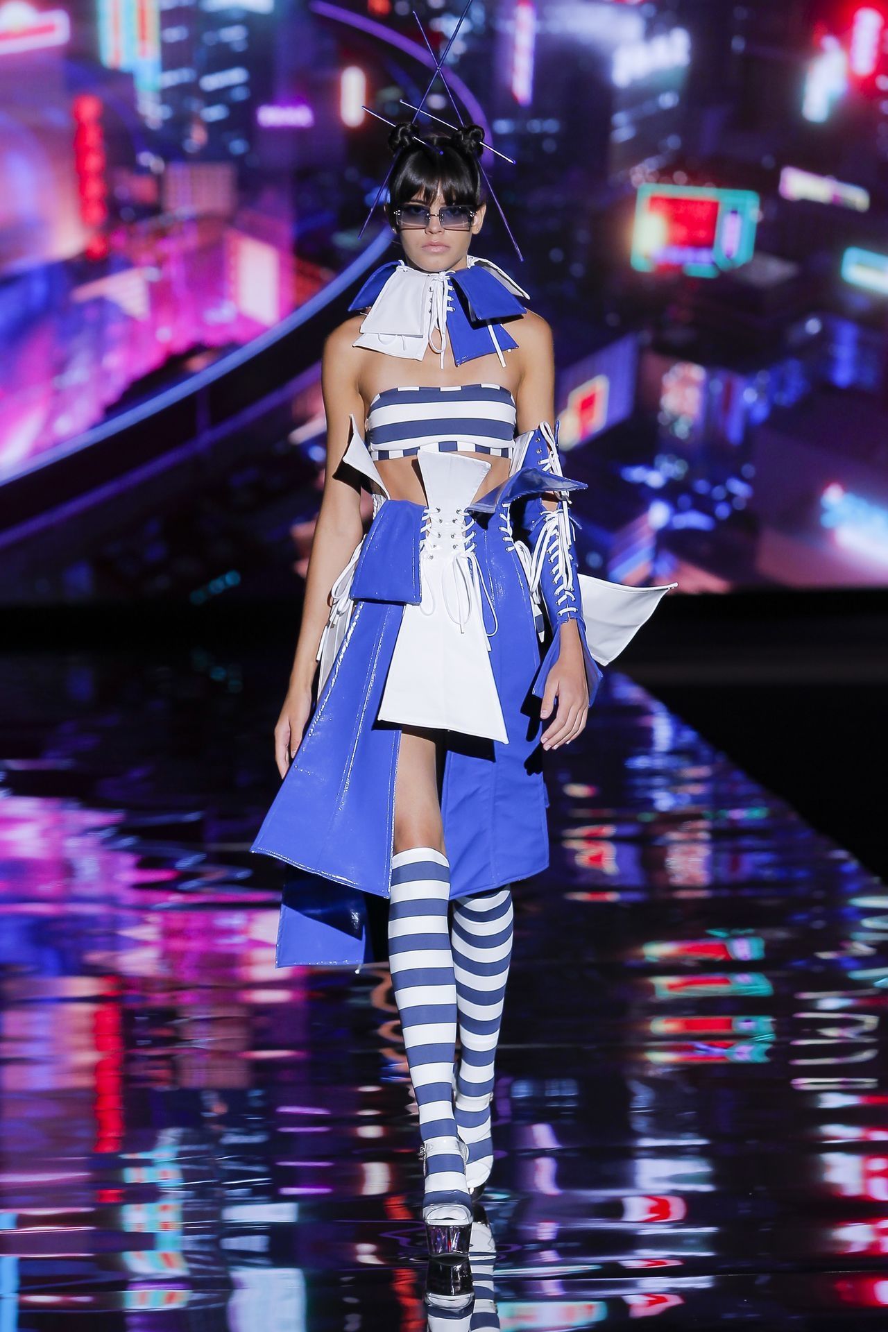
Andres Sarda
Andres Sarda
Variations of the Pantone Colour of the Year ‘Veri Peri’ on the SS22 runway


WORDS
Katerina Perez Is a jewellery insider, journalist and brand consultant with more than 15 years’ experience in the jewellery sector. Paris-based, Katerina has worked as a freelance journalist and content editor since 2011, writing articles for international publications. To share her jewellery knowledge and expertise, Katerina founded this website and launched her @katerina_perez Instagram in 2013.
RelatedArticles
Discover the brand: the story from various angles.